
Global Economy
$109 Trillion and Counting: How the World’s Sovereign Debt Crisis Is Being Built in Plain Sight


Global borrowing has reached a scale that even veteran fixed-income analysts describe as structurally unprecedented — and the composition of that borrowing has changed in ways that make it materially more fragile than the headline figures suggest. The $109 trillion combined sovereign and corporate bond market, according to the OECD, is functioning. But it is functioning under conditions that have not been stress-tested at this size, at these rates, or with this investor base.
A Record That Does Not Inspire Comfort
OECD sovereign bond issuance in OECD countries is projected to reach $18 trillion in 2026, up from $12 trillion in 2022. Outstanding government debt is estimated at $61 trillion. Governments and companies together are set to borrow $29 trillion from bond markets in 2026 — 17 percent more than in 2024 and double the amount borrowed ten years ago.
OECD Secretary-General Mathias Cormann identified the core tension plainly: “Debt-servicing costs are increasing, and AI-related financing needs are growing sharply.” The framing is unusual in that it explicitly links the AI investment cycle to sovereign fiscal stress — not as separate phenomena, but as competing claims on the same capital pools.
In emerging markets, sovereign borrowing hit $4 trillion in 2025, the highest debt stock relative to GDP since 2007. The IMF’s Fiscal Monitor places global public debt above $100 trillion, with risks described as “tilted to the upside.” Under severe scenarios, debt could rise by nearly 20 percentage points of GDP within three years.
The Investor Base Has Changed
The most underappreciated dimension of the current debt situation is not the quantity of debt but who is holding it. Central banks, which were the dominant and most price-insensitive buyers of government bonds through the quantitative easing era, have materially reduced their holdings through quantitative tightening. Traditional long-term institutional buyers — pension funds, insurance companies — now operate alongside shorter-term, significantly leveraged investors.
The OECD’s 2026 Global Debt Report described this shift as “transforming markets with new risks building, potentially challenging the current resilience.” A key vulnerability is that the new marginal buyers are far more price-sensitive than the buyers they replaced. When funding conditions tighten or risk appetite deteriorates, they sell. Central banks, by contrast, were typically indifferent to mark-to-market fluctuations in their bond portfolios.
Governments, responding to rising yields at long maturities, have been systematically shortening the duration of their debt issuance. That reduces immediate interest costs but creates a different problem: it concentrates refinancing risk. A larger share of outstanding debt now matures within shorter windows, meaning governments must return to markets more frequently and are more exposed to whatever interest rate environment prevails at those moments.
The BIS Feedback Loop
The BIS 2026 Annual Economic Report identified a mechanism that connects the AI debt concern to the sovereign debt vulnerability in a single transmission path. The leveraged hedge funds that now dominate sovereign bond markets through basis trades — exploiting small yield differentials between cash bonds and futures — are the same funds most exposed to private AI credit.
If AI returns disappoint and private credit structures begin to unwind, those hedge funds face fire-sale pressure on their sovereign bond positions simultaneously. “Financial stresses can now propagate quickly and broadly through funding markets, across borders and between banks and non-banks,” the BIS stated. The feedback loop runs from AI sector stress to non-bank deleveraging to sovereign bond markets to fiscal space constraint — precisely the sequence that is most difficult to arrest once it begins.
Research from the French Trésor and the ECB demonstrates that high debt itself increases risk premia through a self-reinforcing mechanism: elevated debt raises the term premium, increasing r relative to g (the real interest rate relative to growth), which tightens fiscal constraints further, which increases perceived default risk. The Benefits and Pensions Monitor analysis of this dynamic places the United States as not yet in crisis, but navigating what it describes as “a narrowing corridor of stability.”
The AI Dimension
In 2025, nine major technology hyperscalers raised $122 billion from bond markets alone — nearly half of all technology firm issuance globally. Their projected capital expenditure from 2026 to 2030 stands at $4.1 trillion, roughly 35 percent larger than total capital spending by all US non-financial companies in 2025.
That AI corporate borrowing competes directly with sovereign issuance for the same investor capital. If AI capex slows — as the BIS, Man Group, and Chinese hedge fund managers have warned it might — the unwinding of those corporate bond positions could dislocate markets at precisely the moment governments need those markets to absorb their own record issuance.
The window for governments to get their fiscal houses in order, the OECD concluded, before markets force the issue, is narrowing. The record issuance of 2026 may look, in retrospect, like the high-water mark before the tide turned. Or it may be the moment that the dam held. The difference will be determined by AI adoption curves, interest rate decisions, and political will — none of which are easy to forecast.
Discover more from The Economy
Subscribe to get the latest posts sent to your email.



The global economic outlook in 2026 is best understood as a contest between forces that support production and forces that squeeze purchasing power. Investment can remain strong while families struggle with essential bills. Employment can look resilient while finding a better-paid job becomes harder. A growing economy does not automatically produce a comfortable household budget.
The International Monetary Fund’s July 2026 outlook summary describes uneven growth shaped by war-related headwinds and a technology investment upswing. More recently, Reuters reported UNCTAD’s forecast of 2.6% global growth in 2026, down from 2.9% in 2025. Those are forecasts from different institutions and publication dates, not interchangeable measurements.
The useful question is therefore broader than whether the world avoids recession. It is whether growth becomes more widely shared, financing becomes more affordable, and price pressures ease without a substantial loss of jobs.
Why global growth forecasts can disagree
Economic forecasts differ because their assumptions, information cutoffs and aggregation methods differ. One institution may place more weight on purchasing-power comparisons between countries, while another uses market exchange rates. A forecast incorporating a recent energy disruption can also look materially weaker than one completed months earlier.
Readers should compare the institution, publication date, forecast period and methodology before interpreting two numbers as a disagreement about the same thing. A revision is often evidence that circumstances changed, rather than proof that forecasting has no value.
The IMF’s October 2026 World Economic Outlook page was marked as forthcoming for 13 October when this article was researched. Its final forecasts should not be presented as already released on 10 October. Until publication, earlier estimates need their original dates attached.
The first pressure point: energy
Energy affects far more than petrol stations. Fuel prices influence freight, farming, aviation and industrial production. Electricity costs influence everything from supermarkets to data centres. Businesses may absorb some increases through lower margins, but persistent cost pressure can eventually reach customers.
The US Energy Information Administration’s October Short-Term Energy Outlook forecasts an average Brent price of $105 per barrel in the fourth quarter of 2026. That is a forecast average, not a live oil quotation. The agency links its outlook to constrained Middle Eastern flows and continuing uncertainty over physical supply.
The economic effect depends on duration. A brief spike can disrupt cash flow without changing long-term investment. A sustained increase can alter household spending, government subsidy costs and the economics of entire industries. Energy-importing countries face a different balance of risks from major exporters.
Inflation is a rate, while affordability is a level
A frequent source of confusion is the difference between slower inflation and lower prices. If a shopping basket rises from 100 to 110 and then to 113, inflation has slowed sharply in the second period. The basket nevertheless costs more than before.
That arithmetic helps explain why positive inflation headlines do not always improve public sentiment. Families compare current bills with remembered prices and their own incomes. They do not experience a national average directly. Renters, commuters, pensioners and parents can face very different spending pressures.
Wage growth matters, but its timing matters too. A pay increase received after several years of rising expenses may repair only part of the damage. Households can also carry debt accumulated during the squeeze. An improvement in monthly income therefore does not immediately restore savings or financial confidence.
Interest rates transmit the pressure unevenly
Central banks face a difficult distinction between temporary price shocks and inflation that spreads through the economy. Higher borrowing costs cannot create oil or repair a shipping route. They can, however, restrain demand and influence inflation expectations.
The consequences depend on how debt is structured. A household with a long-term fixed mortgage is less immediately exposed than one refinancing this year. A business with substantial cash reserves can react differently from a company dependent on short-term borrowing.
This creates a delayed adjustment. Some borrowers feel higher rates quickly; others only encounter them when existing contracts expire. Economic activity may therefore appear resilient before refinancing pressure becomes visible. For readers assessing the outlook, debt maturity schedules can be as revealing as headline policy-rate announcements.
AI investment supports demand before its full payoff arrives
Technology spending can lift economic activity through construction, equipment purchases, software development and specialist employment. Those effects occur before businesses demonstrate sustained productivity gains from the technology itself.
This distinction is especially relevant to artificial intelligence. Building computing infrastructure is an investment cycle. Producing more useful output with the same resources is a productivity improvement. The two can reinforce each other, but they are not identical.
McKinsey’s 2026 AI survey illustrates the gap: 80% of respondents reported better individual productivity, while 37% attributed some enterprise-level earnings impact to AI. These are survey responses, not a national productivity measurement. They support a cautious interpretation: adoption can advance faster than measurable financial returns.
Public debt changes the policy room available
When borrowing costs rise, governments with substantial refinancing needs face more difficult choices. Additional interest expenditure can compete with transport, education, health and other public services. Raising taxes or reducing spending may improve fiscal arithmetic while weakening demand in the short term.
Debt sustainability cannot be judged by one ratio alone. The currency of borrowing, maturity profile, investor base, growth prospects and institutional credibility all matter. A government borrowing mainly in its own currency has different vulnerabilities from one heavily dependent on foreign-currency debt.
For emerging markets, exchange-rate depreciation can magnify external repayment costs. It can also make imported fuel and machinery more expensive. The combination of energy exposure and foreign-currency financing deserves particular attention because two external pressures can arrive together rather than independently.
Three scenarios to watch
The following scenarios are analytical illustrations, not numerical forecasts. Their purpose is to connect observable developments with possible consequences.
In an improving scenario, energy supply becomes more reliable, price pressures moderate and business investment broadens beyond a narrow technology cluster. Household purchasing power recovers gradually, allowing consumption to strengthen without a renewed inflation surge.
In a prolonged squeeze, growth continues but essential costs remain elevated. Companies protect margins through restrained hiring and selective price increases. Consumers reduce discretionary spending, producing a divided economy in which strong sectors coexist with financially stretched households.
In a downside scenario, supply disruption combines with tightening financial conditions. Investment plans are postponed, credit losses rise and weaker demand spreads across borders. The important warning would be deterioration across several indicators, rather than a single alarming market session.
What households and businesses can monitor
Households gain more from tracking their own spending basket than from reacting to every national headline. Compare essential bills with take-home income, identify debts approaching a reset, and separate recurring expenses from unusual purchases. These observations make the economic outlook relevant to actual decisions.
Businesses can track order volumes, payment delays, customer cancellations and input costs alongside revenue. Nominal sales growth may simply reflect higher prices. A company that sells fewer units at higher prices is in a different position from one gaining customers and expanding output.
For both groups, the most useful signals are persistent changes. Several months of improving real income, healthier order books or easier financing are more informative than one strong report. Revisions should also be watched: an initially positive estimate can change as better information becomes available.
How to read the next major release
When a new forecast arrives, start with what changed. Was growth revised because demand strengthened, energy assumptions shifted or historical data were updated? Then examine the distribution across countries and the balance of risks. A stable global average can conceal substantial regional deterioration.
Check whether the report describes its central scenario as conditional on events that remain unresolved. Assumptions about trade, conflict and financing are part of the forecast, not background decoration. If those assumptions fail, the headline number may lose relevance quickly.
The strongest reading of the 2026 outlook is neither automatic optimism nor permanent crisis. Growth, affordability and financial resilience are separate tests. A durable improvement requires progress on all three, and readers should judge future releases by whether they show that progress reaching beyond aggregate statistics.
Discover more from The Economy
Subscribe to get the latest posts sent to your email.

7-Eleven, Circle K, and Casey’s lead US convenience retail by store count. See how EV charging is spreading across the top chains and where fuel sales stand.
Key Takeaways
- The US had 151,975 convenience stores at the end of 2025, down 280 from the year before, according to NACS and NIQ TDLinx.
- 7-Eleven is the largest chain by store count, with about 12,700 US locations on CSP’s January 2026 ranking. Circle K, Casey’s, and Murphy USA follow.
- Fuel is still the core. Convenience stores sell about 80% of the gasoline bought in the US, and 122,620 stores now sell fuel, the highest number in eight years.
- EV charging remains thin. Wawa and Sheetz have chargers at 11% to 30% of their sites in a Consumer Reports sample, while the two largest chains have added chargers to less than 1% of their stores.
- Most chains are partnering with charging networks rather than building their own, and that model is shifting as 7-Eleven, Circle K, and Wawa take on more ownership.
Search Intent Summary
Readers searching this topic want to know which convenience chains are biggest, how they compare, and whether they’re investing in EV charging. This guide ranks the top chains by store count, explains the EV strategies, and covers the sales and fuel context.
How Market Share Is Measured
Market share in convenience retail can be measured several ways: by store count, by fuel gallons, or by in-store sales dollars. Public data is strongest on store counts, so this ranking uses store counts. Dollar-share estimates are sold by market research firms, and I did not verify figures that would support a revenue-based ranking.
Different sources also count stores differently. CSP’s Top 202 uses stores owned, operated, or franchised as of January 1, 2026. The NACS/NIQ TDLinx count is a separate industry tally. For Circle K, CSP lists 7,308 stores, while the NACS count lists 6,038 locations, so the figures should not be combined or compared directly across sources.
The Largest Chains by Store Count
On CSP’s 2026 Top 202, the leaders are:
- 7-Eleven: about 12,700 stores, the largest chain in the industry
- Alimentation Couche-Tard (Circle K): 7,308 stores under CSP’s count, the second-largest
- Casey’s General Stores: 2,921 stores, concentrated in the Midwest
- Murphy USA: 1,800 stores, a major fuel-focused operator
- bp America: 1,708 stores
- EG America: 1,464 stores
- QuikTrip: 1,196 stores, a Southern and Midwestern chain
- Wawa: 1,189 stores, a Mid-Atlantic favorite
- ExtraMile: 1,174 stores
- GPM Investments: 1,118 stores
Kwik Trip (919), Maverik (818), Sheetz (815), Love’s Travel Stops (668), and Pilot (658) round out the next tier. The threshold for the top 100 in 2025 was 67 stores, which shows how concentrated the market is at the top.
Store counts shifted in 2025 mostly through acquisitions. Circle K’s gain came largely from finishing its purchase of GetGo Café and Market, formerly owned by Giant Eagle. Sunoco’s $9.1 billion acquisition of Parkland Corp. also reshaped the rankings.
Fuel Sales Remain the Core Business
Convenience stores are, first and foremost, fuel retailers. NACS estimates that the industry sells about 80% of the gasoline purchased by consumers in the US, and the number of stores selling fuel rose by 768 in 2025 to 122,620, the highest count in eight years. Overall, 80.7% of convenience stores sell fuel.
That mix matters for margins and for the strategy of the largest chains. Fuel brings traffic, and inside sales, especially food service and tobacco, bring profit. NACS reported the industry generated $837.4 billion in sales in 2024, driven largely by foodservice. Industry-wide 2025 sales were scheduled for release at the NACS summit in April 2026, and readers should check the NACS site for the latest figure.
Gasoline price swings affect this business directly. National average prices reached $4.41 on October 1, 2026, according to AAA, which means fuel margins and foot traffic move with crude oil headlines.
EV Charging: Who Is Investing and How
Convenience stores have become a major location for public charging, but coverage is still limited. A Consumer Reports study of 75 major retailers, covering 11 convenience-store companies, found that Wawa and Sheetz had EV chargers at between 11% and 30% of their locations, averaging six to ten fast chargers per site. Royal Farms was similar. The remaining chains averaged between two and five chargers per site.
Across the sample, only 1.4% of convenience stores offered EV charging. The study noted that c-stores are the only retail category where nearly all chargers are fast chargers, which is a good fit for a quick stop but expensive to install.
The two largest chains are taking a different approach. 7-Eleven launched its own 7Charge network and app, with a stated goal of building one of the largest fast-charging networks of any retailer in North America. Circle K has partnered with IONNA, an EV charging company backed by eight automakers, to add chargers at 350 US stores, including converting about 85 existing charging sites. Neither 7-Eleven nor Circle K had chargers at more than 1% of their stores in the Consumer Reports sample.
Other chains are moving in similar directions. Casey’s is installing IONNA chargers at several locations in six states, with plans to expand the partnership. Sheetz and Wawa also partner with IONNA. Wawa announced in September 2026 that it would install eight branded DC fast chargers in Pennsylvania through a partnership with Electrify America, its first move into owning and operating its own charging equipment rather than hosting third-party chargers. Wawa has operated EV charging at more than 280 locations since 2017.
The model matters for shoppers. Partnerships usually mean the charging company runs the equipment and handles payment, while the store provides the site and drives traffic. Chains that own their chargers get more control over pricing and reliability, but they also take on the cost and risk.
Customer Satisfaction Rankings
Store counts and charging networks are only part of the picture. The American Customer Satisfaction Index’s 2026 convenience store study, released October 6, ranked Meijer first, followed by QuikTrip in second and a tie for third between Wawa and Sheetz. The survey asked 9,465 consumers to score chains on factors including store hours, coffee freshness, bathroom cleanliness, food quality, wait times, and app usability.
Overall satisfaction fell 1% to 75 points, and store layout and cleanliness dropped 3%. Wawa led in the South and Northeast regions in the survey. The findings suggest that growth in food service and digital offerings is not yet translating into higher satisfaction across the industry.
Practical Guidance for Shoppers and Investors
For drivers choosing a chain, the EV question depends on where you travel. If you drive an electric vehicle, check the chain’s charging network and app before a long trip. Many chargers are partnership sites with different payment systems, so confirm the plug type and fees in advance.
For fuel shoppers, the fuel-selling store count is a good sign of supply, but prices vary by brand and region. Compare the station’s posted price with the AAA state average before you fill up.
For investors and industry watchers, the key questions are whether chains can grow charging in high-traffic locations without pressuring margins, and whether the largest chains will move from partnership models to owned networks.
Future Outlook
Store counts are roughly flat, with growth coming from acquisitions and new formats rather than from a rapid expansion of the total store base. EV charging is growing from a small base, and the chains that build dependable fast-charging networks may gain traffic from drivers who need a quick stop. Fuel price volatility will continue to shape the economics of the whole sector.
Frequently Asked Questions
Which convenience store chain is the largest in the US?
7-Eleven is the largest by store count, with about 12,700 US stores on CSP’s January 2026 ranking. Circle K is second, although counts differ by data source.
Which convenience stores have the most EV chargers?
Wawa and Sheetz had chargers at 11% to 30% of their locations in the Consumer Reports sample, with six to ten fast chargers per site on average. 7-Eleven and Circle K have expanded their charging networks but had chargers at less than 1% of their stores in that sample.
How many convenience stores are there in the US?
The NACS/NIQ TDLinx count put the total at 151,975 at the end of 2025, down 280 stores from the year before. About 63% of stores are owned by companies with ten or fewer locations.
Do convenience stores sell most of the gas in the US?
NACS estimates convenience stores sell about 80% of the gasoline purchased by consumers in the US. Fuel is the core product for most chains, even as inside sales and food service grow.
Discover more from The Economy
Subscribe to get the latest posts sent to your email.
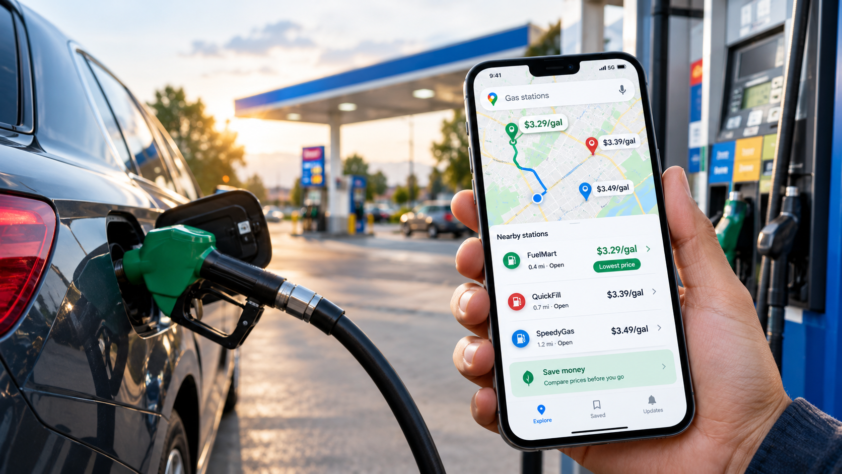
Google Maps shows gas prices at nearby stations, but its data isn’t truly real-time. Here’s how to use the feature, check accuracy, and cut fuel costs.
Key Takeaways
- Google Maps lists gas prices for nearby stations on Android, iOS, and desktop. Tap the gas option, or search “gas” in the search bar.
- Prices come from Google, not from drivers. Users cannot edit them, so accuracy depends on how quickly stations’ prices reach Google.
- Google says its fuel data is updated every 24 hours, so it cannot show the price at a pump at this moment.
- The US national average was $4.41 a gallon on October 1, 2026, according to AAA, up from $3.16 a year earlier. Savings matter more now than they did a year ago.
- Combine the map with AAA’s price tracker and the eco-friendly route setting to find cheaper fill-ups and trips.
Search Intent Summary
People searching this topic want to find the cheapest gas nearby and to know whether the prices they see are trustworthy. This guide shows how the feature works, where its data comes from, and how to use it alongside other sources.
A Note on “Real-Time” Fuel Prices
The phrase “real-time” overstates what Google Maps offers. Google’s Maps prices are shown by Google and are not user-editable. A reviewer testing the feature in 2025 found that major brands such as BP, Shell, and Speedway matched GasBuddy and the stations’ own prices, but some stations updated slowly, especially for grades other than regular, and some stations showed no prices at all.
A Google spokesperson also told a local TV station that the app’s data is updated every 24 hours. Prices can therefore lag behind what a station posts on its sign, and a price shown in the morning may be out of date by afternoon. Treat the map as a comparison tool for finding the cheaper area, then confirm the price at the pump.
How to Find Gas Prices on Your Phone
On Android and iOS, open Google Maps and tap the gas tile under the search bar. The app will show stations near you. Tap a station to see its details, including the listed price.
To look farther away, move the map to a new area and tap “Search this area.” Not every station displays a price, so you may need to scroll through the list. Tapping “View list” lets you compare several stations at once, which is faster than checking pins one by one.
If you already know which station you want, search for its name and tap its listing. The price appears in the station’s details, and you can see how far it is from your location.
How to Find Gas Prices on Desktop
On desktop, search for “gas” or “gas stations near me.” The station icons appear on the map, but prices are not always displayed next to the pins. Click a station to open its information panel, where the price is shown.
Desktop is useful for planning. If you are leaving for a trip, search the destination town or your route’s stops before you leave, so you can decide where to fill up.
Comparing Prices Without Getting Fooled
A cheap-looking price can still cost you more if the station is out of your way. Before choosing a station, check three things.
Distance matters. A five-cent saving on a station two miles away may not be worth the detour. Work out the difference on your tank size: a $0.20 gap on a 15-gallon fill-up is $3.00, which may or may not cover the extra driving.
Grade matters. Some stations show prices for regular only. Premium or diesel prices may be missing or slower to update.
Timing matters. Prices often change through the day, and stations may raise prices after a wholesale increase. Check the map in the morning, then confirm at the pump.
Cross-Check With Trusted Sources
For a reliable benchmark, check the AAA gas price tracker, which publishes daily national and state averages. On October 1, 2026, AAA reported a national average of $4.41 for regular unleaded, down about 7 cents from the previous week. September’s monthly average of $4.33 was the highest September figure on record. AAA attributed the easing to crude oil prices dipping back into the $90 range.
The Energy Information Administration publishes weekly retail gasoline prices, which are useful for tracking longer trends. A station’s price is best confirmed at the station itself, but these sources tell you whether the price you are seeing is high or low for your area.
Crowd-sourced apps such as GasBuddy can add station-level detail, but their data is user-submitted, so compare it against Google Maps and the station’s sign.
Use the Eco Route to Cut Fuel Use
Fuel costs depend on how much you burn, not just what you pay per gallon. Google Maps offers an eco-friendly route option that favors more fuel-efficient driving. The eco option is on by default for many users, so check that it is still enabled before you plan a trip.
Google has said that a fuel-efficient route typically adds one to two minutes to a trip and can save five to ten percent on gas. The savings depend on traffic, road type, and the vehicle, so treat the figure as an estimate.
A simple example shows the scale. Suppose a 300-mile trip in a car that gets 25 miles per gallon. That uses 12 gallons, or about $53 at $4.41 a gallon. A 5 to 10 percent saving is roughly $2.65 to $5.30. Those are hypothetical numbers, but they show that a short detour and a route change can add up across a year of driving.
Practical Strategy for Saving on Gas
Start with the map to find the cheapest station in your area. Confirm the price with the station’s sign before filling up, since the map can lag behind changes.
Compare prices in clusters rather than single stations. If several stations near a highway interchange charge less than the rest, that is a stronger signal than one outlier.
Use the eco route on longer trips, and avoid detours that cost more in fuel than they save at the pump. For a regular commute, the cheapest station on your route is often the best choice.
Keep an eye on the AAA and EIA averages. If your local price is well above the national average, you may be able to save by filling up at a station in a different city or zone.
Future Outlook
Gas prices are tied to crude oil, and crude is tied to the conflict affecting shipping routes in the Middle East. Prices have risen sharply this year, and they have also eased at times. The most useful habit is checking prices regularly rather than waiting for a spike to appear, since station prices can move quickly in both directions.
Frequently Asked Questions
Is Google Maps gas price data real-time?
No. Google says its fuel data is updated every 24 hours, and some stations’ prices update more slowly than others. Use the map to compare nearby options, then confirm the price at the station.
Why do some gas stations not show prices on Google Maps?
Not every station displays a price. Stations may not share prices with Google, or the data may be missing for certain fuel grades. Check the station directly or use a second source.
Can I edit a gas station’s price on Google Maps?
No. Prices on Google Maps are controlled by Google and cannot be edited by users. If a price looks wrong, the station’s posted price at the pump is the most reliable source.
Does the eco route really save gas?
Google says an eco route can save five to ten percent on fuel with a small extra travel time. Actual savings depend on traffic, road conditions, and your vehicle. It is a useful default, but it is not a guarantee.
Discover more from The Economy
Subscribe to get the latest posts sent to your email.

Tesla Physical AI 2026: Robotaxis, Optimus and TSLA Risks

NVIDIA’s AI Grip in 2026: Record Revenue Is Only Half the Investment Story

Hormuz Diesel Shortage: Why Crude Oil Recovery Isn’t Enough

Social Security Extra $90 Deposit: Who Qualifies for the October 2026 Medicare Rebate?

Anthropic Bans Sustained Abuse of Claude AI Under New Usage Policy Effective November 12, 2026

Jeff Bezos Three-Day Workweek View: What He Really Said

Celeste Frozen Pizza Discontinued: What Conagra Confirmed

US–China Critical Minerals Competition: Why a Trade Deal Cannot Fix Every Supply Risk

Oil Price Outlook 2026: How Supply Risks Reach Fuel Bills, Inflation and Business Costs

AI in Business 2026: Why Faster Employees Do Not Automatically Mean Higher Profits

Mortgage Rates in 2026: Why They Remain High and How to Compare the True Cost

Gold Price Outlook 2026: The Forces Behind the Forecasts—and What Could Reverse Them

Global Economic Outlook 2026: Growth, Inflation and Risks

Trump–Putin Diesel Deal: Why Zelensky Is Angry and What It Means for Fuel Prices

Oil Prices Break $100 in 2026: Middle East Conflict & Energy Markets

Middle East War Economics 2026: Oil Prices & Energy Markets

China Stocks Today: Are Big Economies in Asia Nearing a Market Bottom?

PSX Forecast 2026: KSE-100, IMF Reviews & Geopolitics

Crypto Daily Outlook: Bitcoin, Altcoins, and the Future of Decentralized Finance

Global Pension Systems Ranked: The World’s Best and Worst Retirement Frameworks

Enterprise AI Platforms Disrupting B2B SaaS in 2026: Full Analysis

World’s Largest Economies: Ranking the Top Global Powers

Elon Musk’s Next Moves: Disrupting the 2026 Global Economy

Pakistan Economy 2026: Inside the SBP’s Balancing Act

GasBuddy Market Insights: How Crude Price Shifts Impact Local Fuel Cost Averages

World Bank & IMF Reports 2026: Why the “3% Growth” Consensus Is Actually a Debate

Global Equity Market Divergence: US Tech vs. European Dividend Stocks vs. Asian Growth

IMF & World Bank Global Economic Outlook: Growth Forecasts Across Europe and Asia
-

 Markets & Finance9 months ago
Top 15 Stocks for Investment in 2026 in PSX: Your Complete Guide to Pakistan’s Best Investment Opportunities
-

 Analysis8 months ago
Johor’s Investment Boom: The Hidden Costs Behind Malaysia’s Most Ambitious Economic Surge
-

 Analysis8 months ago
Top 10 Stocks for Investment in PSX for Quick Returns in 2026
-

 Banks9 months ago
Best Investments in Pakistan 2026: Top 10 Low-Price Shares and Long-Term Picks for the PSX
-

 Analysis8 months ago
Brazil’s Rare Earth Race: US, EU, and China Compete for Critical Minerals as Tensions Rise
-

 Investment9 months ago
Top 10 Mutual Fund Managers in Pakistan for Investment in 2026: A Comprehensive Guide for Optimal Returns
-

 Global Economy10 months ago
15 Most Lucrative Sectors for Investment in Pakistan: A 2025 Data-Driven Analysis
-

 Global Economy10 months ago
Pakistan’s Export Goldmine: 10 Game-Changing Markets Where Pakistani Businesses Are Winning Big in 2025