
Analysis
Denver Home Prices Are Falling — Is This Housing Relief or Economic Warning Sign?

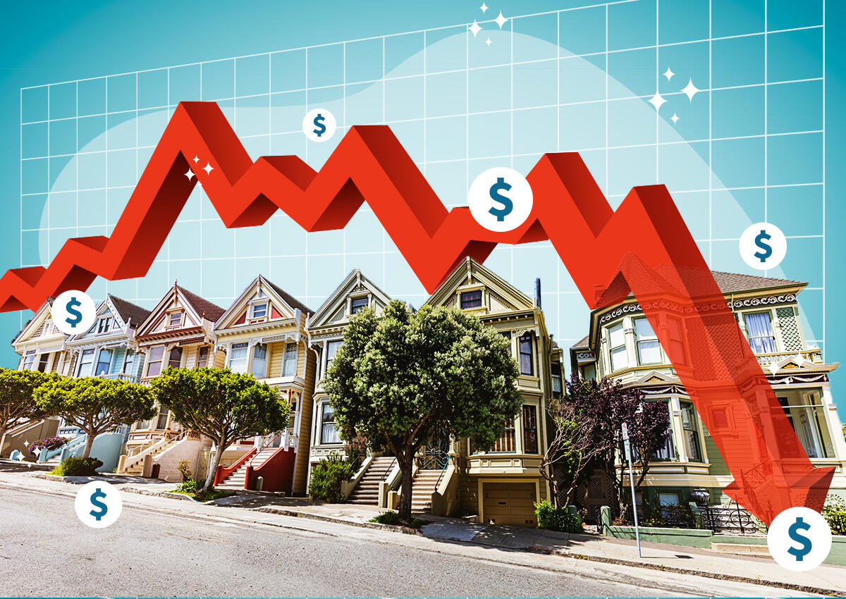
Home prices in Denver and other US cities are falling in 2026. Renters celebrate cheaper housing — but economists ask a harder question: Is this affordability relief, or the early signal of economic decline? Here’s the analysis.
Introduction: When Cheaper Housing Isn’t Simple Good News
At first glance, falling home prices sound like exactly what a country with a severe housing affordability crisis needs. For Denver renters who have watched costs escalate relentlessly since the pandemic, the recent softening in housing costs is welcome relief.
But economists have a more complicated reaction. When home prices fall — particularly in cities that were recently among the hottest housing markets in America — they don’t always signal that the affordability problem has been solved. Sometimes, they signal something more troubling: that the underlying economy is weakening.
Denver is now at the center of this analytical debate. And as home prices soften in other cities across the country, it’s a question worth examining carefully (NPR).
What Is Happening to Denver’s Housing Market?
Denver was one of the standout boomtowns of the 2020s housing surge. Remote work migration, a young professional demographic, and a thriving tech and energy economy drove prices to levels that became increasingly unaffordable for the city’s residents. Median home prices in metro Denver surged dramatically from pre-pandemic levels, and rents followed.
Now, that dynamic is shifting. As of mid-2026, Denver is reporting falling housing costs — one of a number of US metropolitan areas where the post-pandemic price surge is unwinding. The question that economists are debating is the why.
Two competing explanations exist:
Explanation 1: Supply-Side Normalization (Positive)
Denver and cities like it built more housing during the construction boom of 2022–2025. Combined with slowing in-migration as remote work norms stabilized, and some cooling in the labor market, supply may simply be catching up with demand. If this is the driver, falling prices represent genuine affordability relief — exactly what the housing market needs.
Explanation 2: Demand-Side Weakness (Warning Signal)
Alternatively, if prices are falling because economic conditions in Denver are deteriorating — layoffs, slowing business formation, rising unemployment, or declining consumer confidence — then the price decline is a symptom of economic distress, not a healthy market correction. In this scenario, cheaper housing accompanies a weaker job market, eroding the financial position of the very households who benefit from lower rents.
The National Pattern: Denver Isn’t Alone
Denver is not an isolated case. Across the United States, a divergence is emerging between housing markets:
- Cities with supply surplus (Austin, Phoenix, parts of Florida and the Mountain West): Prices are declining as pandemic-era construction catches up with demand
- Supply-constrained cities (New York, San Francisco, Seattle): Prices remain sticky despite affordability stress
- Economically cooling cities (Denver, parts of the Midwest): Price declines may reflect both supply and demand factors simultaneously
The national picture is complicated by a mortgage rate lock-in effect. With the Federal Reserve holding rates at 3.5%–3.75% and potentially raising them further, the millions of homeowners who locked in sub-3% mortgages during 2020–2021 have almost no incentive to sell — dramatically constraining housing inventory in most markets even as prices soften at the margin.
The Affordability Backdrop: Still Crisis-Level Nationally
Even with some local softening, the national housing affordability picture remains dire. Purchasing the average-priced American home now requires about 30% of median household income — up approximately 50% from pre-pandemic levels (Washington Examiner).
The newly passed 21st Century ROAD to Housing Act aims to address this structurally through supply increases and zoning reform. But housing economists project that even the most optimistic supply-side reforms will take two or more years to meaningfully move the national affordability needle.
In the interim, what happens to housing markets in cities like Denver serves as an early-warning system for the broader economy.
Rents vs. Home Prices: Different Dynamics
It is important to distinguish between falling home prices and falling rents:
- Home prices primarily affect buyers, sellers, and homeowner wealth. Falling prices help first-time buyers enter the market, but harm existing owners who bought near the peak.
- Rents affect the much larger population of renters who do not benefit from asset appreciation. Falling rents provide immediate household budget relief.
In Denver, both are reportedly declining — which suggests excess inventory is building in both the purchase and rental markets. This dual softening is the pattern most consistent with economic cooling rather than purely supply-side normalization.
The Inflation Paradox: Shelter Costs Still Rising Nationally
While Denver-specific costs are softening, the national shelter inflation component of the CPI rose 3.3% year-over-year in May 2026 (Experian). This reflects the lag built into the way shelter costs are measured in the CPI — rental contracts signed in 2023–2024 at high rates continue to flow through the index even as new leases may be pricing lower in certain markets.
This creates a policy challenge for the Fed: shelter inflation looks elevated in the data even as market rents in softening cities like Denver are actually falling. It means the CPI may be overstating actual housing cost pressures for current renters in those markets — but will only correct with a lag.
What Falling Prices Mean for Key Stakeholders
First-Time Homebuyers in Denver
Falling prices are genuinely positive for first-time buyers who have been locked out. With the new housing bill also expanding small-dollar mortgage programs, Denver could become more accessible — provided the local economy remains healthy enough to support new homeownership.
Recent Buyers (2021–2024)
Those who bought near the peak face the prospect of negative equity — a situation where their mortgage balance exceeds their home’s current market value. This constrains mobility (can’t sell without a loss) and can trigger financial stress if accompanied by income shocks.
Landlords and Investors
Landlords in markets with falling rents face margin compression, especially if they financed acquisitions at peak valuations and current rates. The institutional investor cap in the new housing bill adds another dimension — restricting the ability of large investors to absorb excess inventory.
The Broader Economy
Housing wealth effects matter. When homeowners see their property values decline, they typically reduce consumption. If Denver’s price declines spread to a significant share of the US housing market, the negative wealth effect could meaningfully slow consumer spending — a potential drag on GDP.
How to Read the Signal: Four Indicators to Watch
To determine whether Denver represents healthy correction or economic warning, analysts will track:
- Local unemployment data — Rising unemployment alongside price falls confirms demand-side weakness
- Rental vacancy rates — Rising vacancies suggest supply surplus; stable vacancies with falling rents suggest demand weakness
- New household formation rates — Are young adults forming households or doubling up? The latter signals economic stress
- Foreclosure and delinquency trends — An increase would confirm that price declines are stress-driven rather than supply-driven
Frequently Asked Questions (FAQ)
Q: Are home prices falling nationally in 2026?
Prices are falling in select markets including Denver and parts of the Mountain West and Sun Belt. They remain sticky in supply-constrained major metros. There is no nationwide uniform price decline.
Q: Why are Denver home prices falling?
A combination of factors: post-pandemic construction catching up with demand, slowing in-migration, remote work normalization, and possible economic cooling. Economists are debating the relative weight of each factor.
Q: Is falling home prices good or bad for the economy?
It depends on the cause. Supply-driven price declines are healthy — they improve affordability. Demand-driven declines signal economic weakness. Denver’s situation may involve both.
Q: Does the new housing bill help Denver?
Indirectly. The 21st Century ROAD to Housing Act focuses on national supply-side reform. In a market like Denver where supply is already loosening, the bigger near-term factor will be the trajectory of the local economy and interest rates.
Q: How does shelter inflation stay high if Denver rents are falling?
The CPI’s shelter component lags market conditions by 12–18 months due to the way rental contracts are measured. Falling market rents in Denver today will only appear in the shelter CPI months from now.
Discover more from The Economy
Subscribe to get the latest posts sent to your email.



Key Takeaways
- Rolex’s secondary market rose approximately 7.9% year-over-year as of 2026 (per WatchCharts data) — trailing Patek Philippe (+16.2%) and Tudor (+11.4%) but still outperforming Audemars Piguet (+3.4%).
- Rolex raised U.S. retail prices 4–9% in January 2026 (steel models ~5.6%, gold models ~8.7%), narrowing the historical gap between retail and pre-owned pricing.
- Not every model appreciates: steel sports references (Submariner, GMT-Master II, Daytona) have held value far better than two-tone or widely available dress references like the standard Datejust.
- The Lady-Datejust posted the sharpest 2026 gain among tracked collections — up 22.73%, from roughly $9,269 to $11,376 — driven by demand for smaller, “everyday luxury” watches.
- Gold’s rise past $2,400/oz has directly lifted the investment case for Rolex’s precious-metal references (Day-Date, Sky-Dweller, Yacht-Master).
The Model-by-Model Picture
| Category | 2026 Trend |
|---|---|
| Lady-Datejust | +22.73% (strongest performer among tracked collections) |
| Steel sports models (Submariner, GMT-Master II) | Held value well; corrected from 2022 peak but stabilized above retail |
| Daytona | Corrected from highs above $50,000 to the mid-$30,000s; still among the most sought-after references |
| Two-tone/widely available Datejust | Flat to negative — “holds value” is an overstatement for this category |
| Gold references (Day-Date, Sky-Dweller) | Lifted by gold’s rise above $2,400/oz |
Why the “Rolex Always Appreciates” Myth Is Fading
The pandemic-era boom pushed some references — the Daytona above all — to speculative highs disconnected from historical norms. Since the March 2022 peak, steel sports models have compressed meaningfully, and dealers who bought inventory near the top have in some cases faced 20–40% markdowns on liquidation. The lesson for 2026 buyers: Rolex as a category is not a monolith. Value retention depends heavily on specific reference, condition, and whether the piece comes with box and papers (“full set”).
What’s Actually Driving 2026 Strength
- Retail price increases raise the floor. When a new Submariner retails at $10,050 (up from $9,500), a pre-owned example at $11,000–$12,000 suddenly represents a smaller premium — narrowing the gap without secondary prices actually moving.
- Supply discipline remains Rolex’s core lever. The brand has never confirmed production numbers, and secondary-market premiums remain entirely a function of Rolex’s own manufacturing decisions — a risk factor as much as a support.
- Certified Pre-Owned rollout. Rolex’s now fully rolled-out CPO program has changed how buyers transact in the used market, adding a layer of brand-verified legitimacy that supports pricing.
The Case for Rolex as a Portfolio Diversifier
Financial advisors increasingly frame luxury watches not as a replacement for equities or bonds, but as a tangible, historically low-correlation diversifier — one that carries its own risks (illiquidity, condition-dependent pricing, no yield) but has demonstrated multi-decade resilience for specific references.
Is Rolex a good investment in 2026?
It depends heavily on the specific reference. Steel sports models like the Submariner and Daytona have held or grown in value; two-tone and widely available dress models generally have not. Overall, Rolex’s secondary market rose about 7.9% year-over-year in 2026, trailing Patek Philippe but ahead of Audemars Piguet.
Discover more from The Economy
Subscribe to get the latest posts sent to your email.

Navigating Mortgage and Loan Refinancing in a High-Yield Environment
Global public debt crossing critical thresholds has kept central bank policies volatile, resulting in fluctuating US Treasury yields throughout 2026. For homeowners and commercial property holders burdened by previous high-interest borrowing cycles, finding optimal refinance windows has become a high-stakes financial puzzle. Stalled disinflation and stubborn employment numbers mean rate cuts are incremental, requiring borrowers to act with precision.
Timing your mortgage or commercial loan refinance in this environment requires a deep understanding of yield curve movements and lender risk appetites.
Decoding 2026 Refinance Dynamics
The 10-Year Treasury Yield Benchmark
Mortgage rates continue to track closely with the 10-year US Treasury yield. When macroeconomic anxiety spikes debt issuance, yields rise, tightening consumer borrowing capacity. Savvy borrowers monitor weekly Treasury auctions to lock in rates during brief dip windows.
Hybrid ARMs and Alternative Structures
With fixed rates remaining elevated, 7/1 and 10/1 adjustable-rate mortgages (ARMs) have surged in popularity. These products offer lower initial monthly payments, giving borrowers breathing room until central bank easing cycles fully materialize.
| Loan Product | Current Rate Range | Best For | Key Risk Factor |
| 30-Year Fixed Mortgage | 6.2% – 6.8% | Long-term predictability | Higher initial monthly outlay |
| 7/1 Hybrid ARM | 5.5% – 5.9% | Short-term ownership / flipping | Rate reset risk after year 7 |
| Commercial Refinance | 7.0% – 8.2% | Corporate asset restructuring | Strict DSCR lender covenants |
Actionable Steps for Successful Refinancing
To maximize your chances of securing favorable refinance terms in a volatile market, follow a disciplined preparation strategy.
Boost Your Credit Score Immediately: Lenders in 2026 are applying stringent credit tiering; a 20-point increase can drop your APR by a crucial quarter-point.
Shop Regional Credit Unions: Smaller financial institutions often offer portfolio loans with more flexible underwriting than major national banks.
Calculate the Break-Even Point: Ensure your total closing costs are recouped through monthly savings within 24 months of closing.
“Market Strategist View: Refinancing in 2026 is an exercise in opportunistic timing. Borrowers must maintain immaculate financial profiles ready to strike the moment Treasury yields dip.”
Mastering the complexities of today’s debt environment ensures you can successfully lower your debt service costs and protect your long-term financial stability.
Discover more from The Economy
Subscribe to get the latest posts sent to your email.

The days of pulling generic auto insurance quotes based purely on your zip code and age are officially over. In 2026, insurance comparison engines are powered entirely by generative AI and real-time telematics. These platforms digest thousands of live data points—ranging from your driving smoothness via connected vehicle sensors to real-time traffic congestion patterns—to generate hyper-personalized premiums instantly.
For consumers, this evolution represents both a massive opportunity for savings and a hidden trap for penalty pricing. Understanding how AI algorithms evaluate risk is essential for anyone looking to lower their monthly auto insurance premiums.
How AI Comparison Engines Evaluate Your Risk Profile
Behavioral Telematics and Connected Cars
Modern cars stream performance data directly to insurance aggregators. Generative AI models analyze braking sharpness, acceleration curves, cornering G-forces, and phone distraction metrics. Drivers who maintain smooth, defensive habits are rewarded with dynamic rate cuts of up to 40% compared to traditional rating tiers.
Predictive Traffic and Weather Modeling
AI tools now cross-reference your daily commute route with predictive weather and accident probability models. If your standard parking location or driving corridor has a statistically higher incidence of uninsured motorist claims, your quotes will reflect that hyper-local risk assessment.
| Comparison Factor | Traditional Rating Model | 2026 Generative AI Model | Impact on Premium |
| Mileage & Usage | Annual estimated odometer reading | GPS tracking & live trip duration | High (up to 35% savings) |
| Driving Behavior | MVR driving record & accidents | Real-time braking, speed, & G-force | Critical (determines tier) |
| Vehicle Tech | Make, model, and safety rating | ADAS calibration & repair cost data | Moderate |
Strategies to Lower Your AI-Driven Insurance Quote
To outsmart the algorithm and secure the lowest possible premium in 2026, drivers must proactively manage their digital footprint on insurance platforms.
Opt-In for Telematics Trial Periods: Many insurers offer immediate 15% discounts just for installing their driving app; let it track safe habits for 30 days to lock in permanent savings.
Scrub Unverified Public Records: Ensure your motor vehicle report is free of clerical errors that AI risk models misinterpret as reckless behavior.
Compare AI Aggregators: Use platforms that integrate multi-carrier API feeds rather than single-brand comparison sites to find the best risk-adjusted rate.
“Industry Note: AI-driven pricing rewards transparency and precision. Drivers who actively manage their telematics data consistently out-save those relying on legacy quote calculators.”
Embracing AI comparison tools allows savvy policyholders to customize coverage limits precisely to their driving habits, eliminating wasted premium spend while ensuring robust protection.
Discover more from The Economy
Subscribe to get the latest posts sent to your email.

Silver Price Today: Why the Xi-Trump AI Standoff Is Fueling a Safe-Haven Rally

Citibank & Dólar Estadounidense: Forex Playbook After the Xi-Trump Truce

How the Trump-Xi White House Summit Is Reshaping Mortgage Rates Today for Real Estate Investors

Indonesia Navigates Mega-Project Risks as China and Russia Eye the 2,772km Trans-Kalimantan Railway

Trump-Xi 2026 Summit Takeaways: The Trade Truce, Taiwan, and the AI Divide

Solar Panel Installation Cost in 2026: Why the Math Changed Overnight

Business Insurance: What Coverage You Actually Need and What It Costs in 2026

Auto Insurance Quotes: How to Get the Lowest Rate Without Losing Coverage

Huntington Online Banking: Full Features, Fees, and How It Compares in 2026

Apply for a Bank Account Online: What You Need and How Long It Actually Takes

World’s Largest Economies: Ranking the Top Global Powers

Business Loan: A Complete 2026 Guide to Rates, Types, and Qualifying

Fast Invoice Factoring: How to Turn Unpaid Invoices Into Cash Within 24 Hours

Investment Banking Services: What They Cost and How to Choose the Right Firm in 2026

Top 30 Stocks for Investment in PSX for Massive ROI in 2026

SpaceX Starship Flight 14: First Orbital Attempt & Starlink V3 Launch Explained

Oil Prices Break $100 in 2026: Middle East Conflict & Energy Markets

BRICS+ Cross-Border Payments 2026: Interoperability Explained

AI Chip Stocks 2026: The Best Semiconductor Investments Beyond Marvell

Fidelity Investments Review 2026: SPAXX Yields & Zero-Fee Funds

Tween Back-to-School Trends 2026: What’s Driving the $85B Season

10-Year Treasury Yield Hits 4.80%: What It Means for Rates & Portfolios

Shein Clothes Quality & Safety in 2026: What Lab Tests Show

IMF & World Bank 2026 Global Economic Outlook: Growth, Inflation, Debt

China’s US$10.8 Billion Trade Shortcut: Why the Pinglu Canal Matters

High-CPM Finance Niches 2026: Publisher Monetization Blueprint

Middle East War Economics 2026: Oil Prices & Energy Markets

China Stocks Today: Are Big Economies in Asia Nearing a Market Bottom?
-

 Markets & Finance9 months ago
Top 15 Stocks for Investment in 2026 in PSX: Your Complete Guide to Pakistan’s Best Investment Opportunities
-

 Analysis7 months ago
Johor’s Investment Boom: The Hidden Costs Behind Malaysia’s Most Ambitious Economic Surge
-

 Analysis7 months ago
Top 10 Stocks for Investment in PSX for Quick Returns in 2026
-

 Banks8 months ago
Best Investments in Pakistan 2026: Top 10 Low-Price Shares and Long-Term Picks for the PSX
-

 Analysis8 months ago
Brazil’s Rare Earth Race: US, EU, and China Compete for Critical Minerals as Tensions Rise
-

 Investment9 months ago
Top 10 Mutual Fund Managers in Pakistan for Investment in 2026: A Comprehensive Guide for Optimal Returns
-

 Global Economy9 months ago
15 Most Lucrative Sectors for Investment in Pakistan: A 2025 Data-Driven Analysis
-

 Global Economy9 months ago
Pakistan’s Export Goldmine: 10 Game-Changing Markets Where Pakistani Businesses Are Winning Big in 2025